
Techniques for long-form content that you must know
Techniques for long-form content that you must know
Summary: Using formatting techniques like bullet points, bolding, highlighting, callouts, and visuals can improve the readability and effectiveness of long-form content.

Have you ever noticed that we don't read every word on a web page?
On the web, we're usually looking for specific information. That's why we scan: we fix our attention on summaries, visuals, and bookmarks to quickly locate what we're looking for.
Formatting techniques not only increase readability, but also help us to scroll through content effectively, especially when we're talking about long-form content.
Great ways to do this include:
Using formatting to guide the reader's attention
Implementing subheadings
Shortening sentences and paragraphs
Including infographics to illustrate complicated concepts
The following insights will help you understand this better.
First step: planning and editing
Long-form content is designed to be readable, have context, be backed up by research, and provide the reader with some value.
Therefore, before embarking on any formatting technique, you need to clearly define who will be reading the content, the reader's objectives, and the impact you want the content to have on them.
Content developed without careful analysis is often unnecessarily long. Before formatting, evaluate your content to see if it can be refined, reduced, or rewritten. Deleting unnecessary details reduces page length and makes your content more attractive.
The following questions can guide you:
Is this content essential?
Can this content be condensed?
Can this content be made simpler or more precise?
Basic structuring strategies
Once you've created the outline and draft of your content, it's time to structure and format it. These two techniques go hand in hand.
Formatting ensures your content is predictable and easy to read; structuring defines an effective organizational strategy to deliver the content. Before applying formatting, strategically structure your content to ensure it is logical and coherent.
With good content structuring, readers can form a mental model of the page and navigate it efficiently, as they will notice a pattern of repetition.
Here are some simple strategies for structuring content:
Useful overview: gives readers a complete idea of a page without delving into the details with a page index.
Create content blocks: divide the body of content into sections and blocks of text to make it easier to read.
Offer direct access: Use links within the page to allow users to navigate through specific sections and reach other content of interest.
Disclose information progressively: Allow users to access the first level of content and disseminate the rest on request, for example, by using accordions.

An accordion is made up of 2 to 3 main components: header, icon (optional), and panel. These elements offer users control and flexibility in accessing information and maintaining an organized interface. The panel appears when the accordion is expanded.
Content-formatting techniques you must know
With the content structure defined, formatting comes into play. The formatting techniques that most help users navigate and consume long-form content efficiently are summary, bullet points, bolding and highlighting key points, callouts, and helpful visuals.
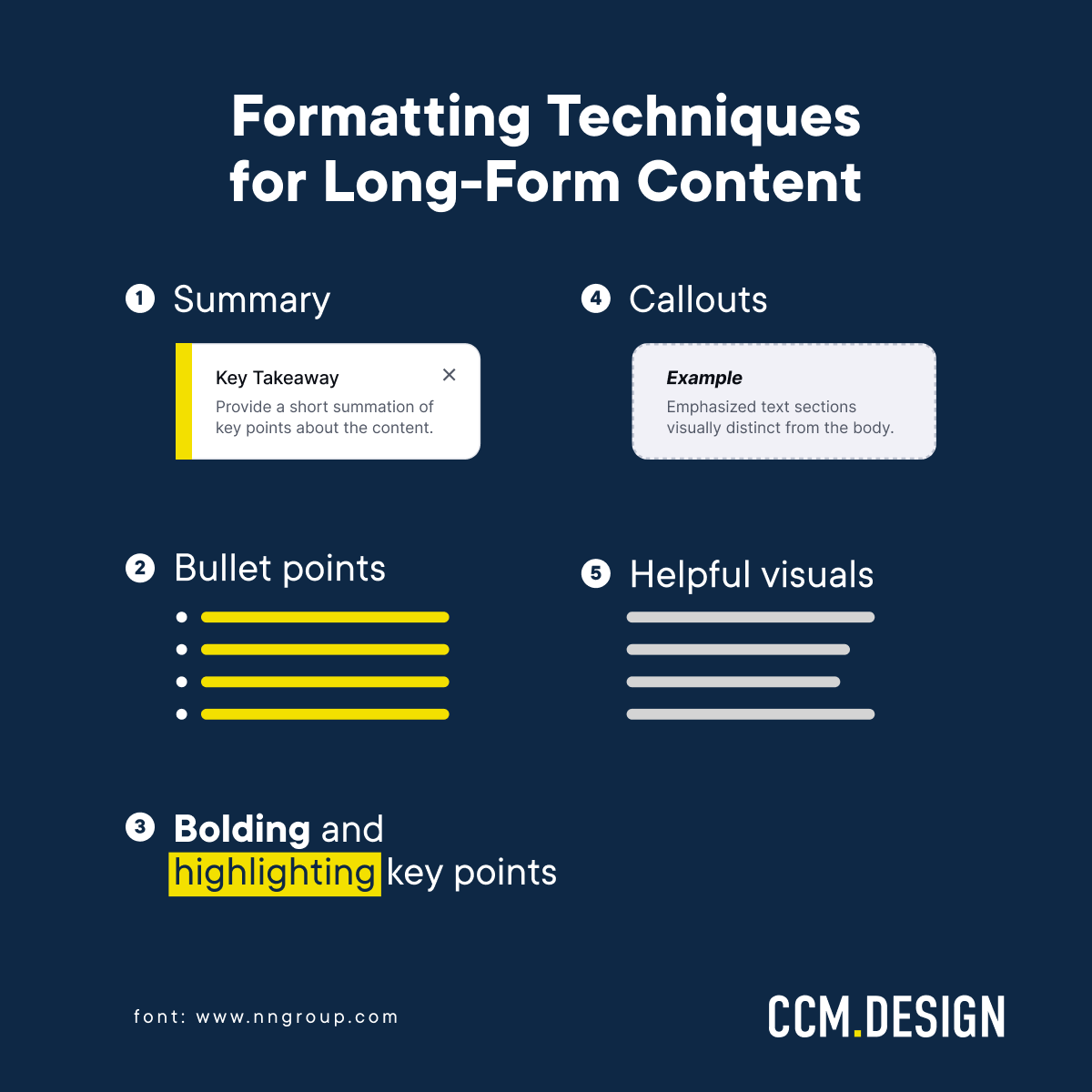
1 - Summary
A summary should communicate the main points of a piece of content. It aims to help users decide whether they are interested in the content or to access the essential information without reading all the details.
Summaries should be concise and to the point. Using a bulleted list increases readability and consumption if your long content has many important takeaways. This way, users can see the main conclusions to decide if the article is relevant.
Use a descriptive title and a different look, such as borders, to make it easy to distinguish the summary section from the rest of the body text.

Even though summaries mostly provide an overview of the whole article, some long pieces of content can benefit from summaries for each section.
This way, you can place the summary in different parts of the article: at the beginning, throughout, or at the end.
At the beginning
A tip when writing this type of summary is to anticipate at least three key points and the main arguments right away so that the reader can quickly determine whether the article is relevant.
If they are interested in more details, they can read the content with the certainty that the information is helpful to them.
Throughout the article
Some long articles have summaries for each section. These summaries are usually placed at the end of the section to make it easier to read and understand. They serve as checkpoints for the reader, especially those skimming or looking for something specific.
Adding a summary after each section of text offers readers brief recaps that direct them back on the right track, facilitating navigation and skimmability.
At the end
Users rarely reach this point before leaving the page, but they offer readers that conclusion while reinforcing the main points. You decide how to use them.
Remember that it's not necessary to include all of them in your long-form content. If you must choose one of the three, our tip is to choose the summary at the beginning of the content.
2 - Bullet Points
Bullet points aid reading, emphasize the main topics, and reveal the relationships between items.
When used correctly, bullets are easily perceived as part of a group due to the human eye's tendency to follow lines and curves, continuing them.
For readers, bullets are great because they are succinct, allow them to see what they want to know, and scan the content more quickly.

They can save readers time, but only when they’re used correctly. If the bullet is too long, it can result in an unwanted wall of text, preventing efficient reading.
When creating your bullet list, keep in mind these 4 tips:
Consider bullet for lists of 3+ items
Use similar line lengths
Start each list item with the same part of speech (for example, always starting with a noun or a verb)
Place unique words at the beginning of each list item
3 - Bolding and highlighting key points
Use bolding and highlighting selectively to capture the most important points of the text and draw the reader's attention.
The highlights work by creating contrast within the text body. It needs to be sparsely used to have some effect. That's why the highlighted text should make up no more than 10% of an article. Remember: if everyone is shouting, no one is heard.
Using too much bold text, especially in information that is not so relevant, can slow down the reading and confuse the reader.
4 - Callouts
Callouts are used strategically to guide the reader toward useful information, setting a paragraph apart from the rest of the text.
A Callout can highlight a statistic, a thought-provoking quote, an example, or a definition, take advantage of the visual weight to attract readers' attention.
Visual weight measures how much design elements attract the reader's attention. For example, objects that are larger in size, simpler in format, and use darker colors appear more visually attractive — like this callout.
5 - Helpful visuals
Much more than decoration, visual elements add informative value to the content and increase readers' interest when they arrive at the page.
This formatting tool can be divided into informative visual elements (e.g., product photos and infographics) and decorative visual elements (images and illustrations).
Informative visual elements
Informative elements provide information that adds value to the content, and readers will spend more time looking at them carefully.
They help readers understand the content by simplifying complex concepts and making abstract information tangible.
Decorative visual elements
On the other hand, decorative visual elements don't communicate such important or useful information, but they allow the eyes to rest from reading.
In general, they are used to create visual interest, but they can unnecessarily increase the size of the page. Use with caution.
For example, instead of using meaningless generic images, consider images with informative values that are appropriate to the context.
Explore different long-form content
Be creative with different formats for long-form content and explore other alternatives for knowledge products. Here are some ideas:
Information summaries: provide readers with an easy-to-access resource for all the data relevant to their research, such as this collection of resources from the Data for Development Network.
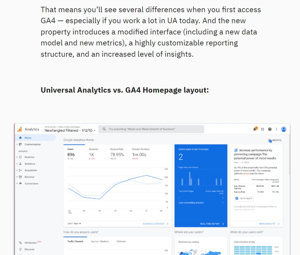
Step-by-step guides and tutorials: use a combination of text, images, GIFs, and videos.
Definitions of niche terms/concepts or case studies: use this format to target your ideal reader, as well as to position your research as the answer to future needs in your field.
Conclusion
Web readers are always looking for specific information. In long-form content, they scan the text, striving to read as little as possible.
So, reading must be supported by careful editing, strategic structuring, and effective content formatting.
To break up your content and create a dynamic and engaging reading experience, use summaries, bold and highlighting, bullet points, callouts, and helpful visuals.
With these tips, your long-form content will have better results, keeping readers with your content for longer.
And let us know if you need support when formatting your content. We know that formatting long content, especially for academics, can be a challenge. We're here to help.